Thursday, 15 May 2014

The direction of my project has taken a turn and I am now re-exploring aspects of my spatial generator and the notion of safe houses. 


This clay model is a literal representation of a standard knot. It occurred to me that the shape it takes can be both interesting and beautiful. This experiment gave me the idea that I could use shapes derived from a knot in the structure and/or form of the house.

Anther experiment exploring connection via knotting

Precedents
aesthetic

Mima Architects
These two white washed houses are very aesthetically appealing to me at the moment. Particularly interesting and usable are the use of overhang in the above picture, which distracts from the cubic nature of the house. The Hafner House below appeals, I think, due to the use of different levels/heights to create interest and windows which highlight the structure. It also has a curved floor plan that would easily be incorporated into a knotted design.

Hafner House by Peter Gutherie
Precedent
safety

Closed state
This project looked specifically at safety, particularly locking intruders out. "Shutters" helped to close off the building, along with roller doors and bridge to the pool which can be elevated. Like a hermit, this building is not at all welcoming in its closed state.

Open state
Precedent
Taiponapona

Knot House by Mass Studies
These precendents use the idea of knotting directly in their structure, which has some engaging results. It's interesting to see how transportation (of people) is effected by these forms.

8 House by BIG

Apollo Architects

Precedent
disguise

Lucid Stead by Phillip K Smith
Disguise is a solution for danger often found in nature in both plants and animals. I believe this image, the use of mirrors could be a somewhat successful tool for disguise in architecture, despite the fact that houses are too big to hide, especially in a residential area like our project suggests.


Work Processes


The result of this sunlight study showed that most of the sun would be coming into the North-West side of the house, in this case, the back of the section. This means that the most frequently used rooms (lounge, kitchen, bedrooms) should be at the back of the house where the laundry, bathrooms etc could be at the front.

Tuesday, 13 May 2014

Ideas at Interim


Sketching/design process
Floor Plan (left= ground floor, right= first floor)


Perspective

At Interim Critique I presented these concepts, however, I was unsatisfied with my work. What I established was lacking was the little connection I had between two significant generators in the brief; taiponapona and crime prevention. From here, I rewound my design process to explore more ideas build from taiponapona and crime prevention that would influence the aesthetics of the house.

Saturday, 10 May 2014

Spatial Generator

Taiponapona- to knot things together

This term was an important catalyst. To me it referred to the action of connecting (or untying) things and I was also quite interested in the physicality of knotting. These are the results of some of these ideas:


The last image is a still from a movie I made about the action of knotting and the surfaces and materiality of various objects. Unfortunately, I came across some problems and couldn't export the movie, however I will remake it soon. 

Monday, 5 May 2014

Naenae, Knotting and Personal Research

Teaming my spatial generator, taiponapona (knotting) with the reports on Naenae, particularly the crime statistics, established a connection that was security. Not only do knots connect or secure things together, but they often provide a system of locking that can be versatile in including or excluding things/people. 

Returning to the Naenae statistics, there were two aspects that struck me as being particularly relevant and/or interesting. Firstly, my group looked at the demographics of Naenae and discovered that the houses were generally inhabited by either retired people or young families. Naenae has the advantage in both cases as being relatively cheap to live and quiet. What we also drew from the information was that the area seemed to be a temporary living location. From these results we can say that the house requirements should be:
  • Relatively small (Perhaps one master bedroom and one other bedroom that could be shared by small children.)
  • Generous storage
  • Maximum garden space
Alternatively, the other piece of information on Naenae that appealed to me was the crime statistics. Naenae has a significant crime rate, perhaps increased by the many alleyways intended to make it a dynamic walking community. Some of the crimes mentioned that were felt to be valid by Naenae residents were:
  • graffiti
  • petty crime (theft and shoplifting)
  • domestic violence
  • generally feeling unsafe (particularly by elderly and parents re:children). Sometimes about neighbours
  • aggressive dogs
  • drug use
  • gangs
As mentioned above, the vulnerability of children and the elderly is only worsened by the fact that they make up a significant part of Naenae's population.


From here, I began looking at some precedent work that considered crime prevention and stilt houses that I thought could be a solution to that topic. 

Female Prison in Iceland by OOIIO Architects.
This design was generated by the gears of a clock. The shape of this is clear here and it also suggests security through surveillance. If a guard were to stand in the middle of the rings, he/she would be able to see all of the prisoner's cells. There is more information on it here.


I also found an article that gave particular suggestions on how to prevent crime through environmental architecture. This will be a useful reference.


Arnhem Prison, David Leventi.
The dome structure and sheer size of this  creates a strong feeling of intimidation. This is the opposite of what I want my house to feel like. However, the design elements make it very hard to escape. Elements of this could be used in the opposite format in my design to make the house warm and difficult to penetrate. 


Fantasy House by Benoit Challand
Toda House by Kimihiko Okada
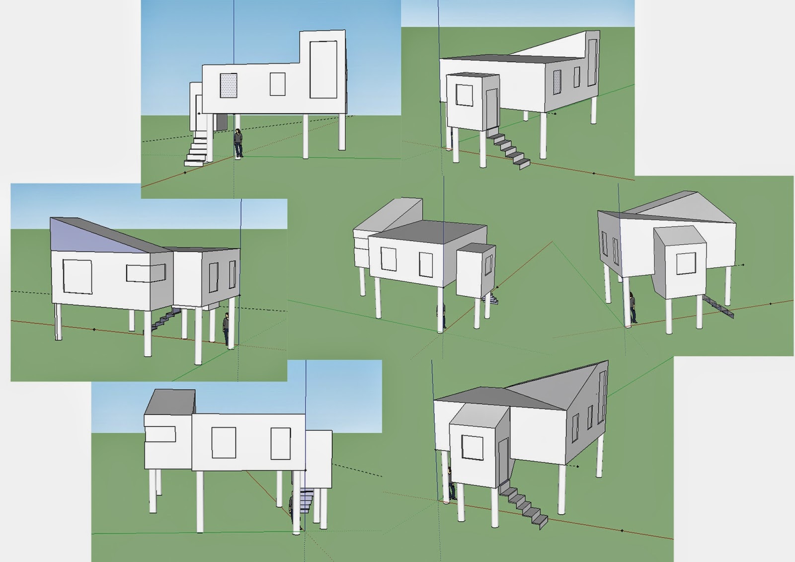
The stilts tag on the dezeen website introduced some interesting houses on stilts. They seemed to be generally either small in order to support them or alternatively, partially supported by land and larger in scale. Both steel and wood were used as stilts. Stilts provide a series of advantages, namely that 
  • Their elevation makes them harder to intrude (crime prevention)
  • It serves a solution to the flood risk in Naenae
  • The space under the house becomes useable garden area (housing requirements for the demographic)
Family House St Josephs by Wolfgang Tschapeller.
One building that seemed to encompass both of my concerns is Tom Kunding's cabin on stilts that is "virtually indestructible".
Sol-Duc cabin.
The aesthetics are not very welcoming at it made me realise that I have been tending towards serious right-angled, hard-surfaced houses because of the serious nature of crime prevention. This is a total opposite of my project last time. I feel that it is also very important to give the house a homey feel since it will be for living rather than imprisonment/working/Apocalypse hideout. 

Monday, 28 April 2014

Kaitiakitanga: homegrown resilience

Moving on to the second project, Kaitiakitanga has more restrictions than Puna and poses some interesting possibilities.

One of the most important factors is the limited space we have. Only 400m² for a potential family house will require innovative ideas. One of my first responses to the size is the concept of the capsule hotel. I believe that this one successfully portrays how a small space can be used to its maximum potential. 

In class today we analysed the spaces inside a given floor plan and then, in groups we compared the arrangement of the spaces through different architectural periods. Under the categories of purpose, privacy, inside/outside, wet/dry, fluidity and noise we discovered than generally the older designs separated the the opposite areas. For example, one end of the house would have all the leisure areas and the private spaces (bedrooms etc) would be on the opposite end. In the contemporary floor plans however, there was a greater sense of integration. It may also be relevant to note that the older plans would have had greater restrictions such as the old fashioned standard window size, which interferes with an inside/outside flow found in the modern designs. More often the modern houses had two floors and the older ones were only single storey. 

Thursday, 3 April 2014

Touch ups

After the formative presentation it was apparent that there were some aspects I forgot to include. 

The orthographic set above now contains the details of the tank, including joists to hold it up.


The mesh suggests the filtering system which is protected by the filter box which prevents algae from getting trapped in the mechanics. The height of the bench I calculated by taking the measurement of an average person's flat hand to foot and adding the depth of the sink. In this way it would be a comfortable height to wash the dishes and work on the bench. 


Finally, I adjusted the hues on this photo to make the room look more similar to the actual colours of the walls. 

These fibre optic lights would be similar to the ones I would use. I would like to use them because they disperse light in an unevenly.

Boltshauser Architects source here
This is a similar idea to mine but on the opposite plane of the room. Aquariums can be linked to my work very easily although they contain a lot more water and fish. As seen here, water aqariums can create a calm space.

Formative Presentation

Peer Review:

Emma.

Emma had an effective and interesting idea that genuinely aided her client's homely ritual, however, I feel that there was a missing element in her design that could have bridged the busy vs. not busy ratio. Perhaps the qualities of the materials she used could have been explored in more depth to add volume. I really liked the idea of the hammock but it suggests that the viewer, reclining in the hammock could have some ceiling ornament as this is where he/she would be looking.

Emma S

Emma presented her ideas verbally in a very logical and clear way that was easy to follow. Her innovative idea for hide-away furniture to suit her client's minimalist taste really impressed me, however, I thought that this idea of minimalism could have been explored deeper and taken further.

Saphera

Saphera's technical ability in her paintings were admirable and effectively demonstrated the ideas of her design. Also effective was her video, however I couldn't help wondering what these hanging objects would look like in an irregular order. The room she created was dark and in some ways scary which led me to think that adding mirrors could heighten this to make it even more effective.

Kayla

Kayla's work was clearly well thought out, although it was hard to follow her presentation because I couldn't hear her. The work was cohesive, busy and kinetic and her slides effectively displayed her design. The connections between her homely ritual and final were clear.