Saturday, 31 May 2014

Extras

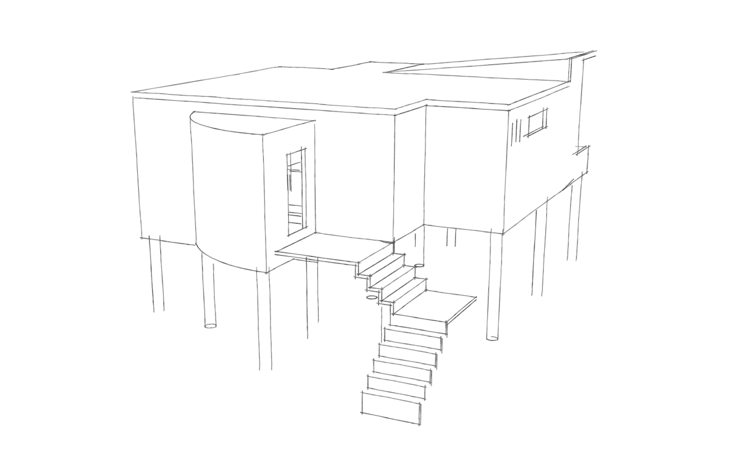
These are my final hand drawn views which I digitally illustrated in photoshop later. They are not to scale in this picture.


Another material sample, knitting copper wire. This was somewhat unsuccessful due to the fact that it was really hard to knit.

My material study included a piece of mdf and knitted wool. This is an excerpt of the detail at the bottom of the walls. 


For my model I used cardboard, balsar wood, felt, paint, foam board, matchsticks, pencil and frosted plastic sheet. It is at a 1:100 scale.

Wednesday, 28 May 2014

Developmental Work

In retrospect, my work process has changed quite a lot. I began with vague idea about stilts, which is the one aspect that has remained from my initial ideas. These drawings are a collection of my house design in chronological order


Initial designs in week 3/4:


Alterations in week 4/5:


Rendered image, post sketch up model:

Initial illustration for a cross section:
(I decided that this look was too unsophisticated, didn't portray the aesthetic of the house)

Tuesday, 20 May 2014

My discussion with Mercia today opened a new perspective on safety that is easily adaptable in a house. This is the idea that the exterior of the house is protected, impenetrable and cold, whereas the interior could become a safe haven, snuggly, transparent and warm. 

In turn, this has developed a close relationship with private vs public space, where the boundaries are clearly expressed from the street, however the spaces are blurred within the house.

Mercia was particularly interested in my knitting sample and suggested that I use it to a greater extent. It would be possible and/or effective to use this as a texture on the walls of my house (creating a sense of fuzzy homeliness/safety) and also as a replacement to the glass on the bottom of the walls. This would make the aesthetic cohesive and allow some kind of transparency through the gaps in the knitting. I am now interested in sampling this knitting with different kinds of wool/materials/recycled wool. This may also be an effective method of insulation, which so many state houses lack.

I have made a Sketchup model and below are some light experiments, illustrating the effectiveness of the room arrangement and building height.


Light entering the living areas on in winter at midday.

Light suggestion for the middle of summer, midday.

Afternoon light on the shortest day of the year.

Midday on the longest day of the year.

Friday, 16 May 2014

Developments

Over the past few days I have been tying together the aspects of my brief and these are the results.


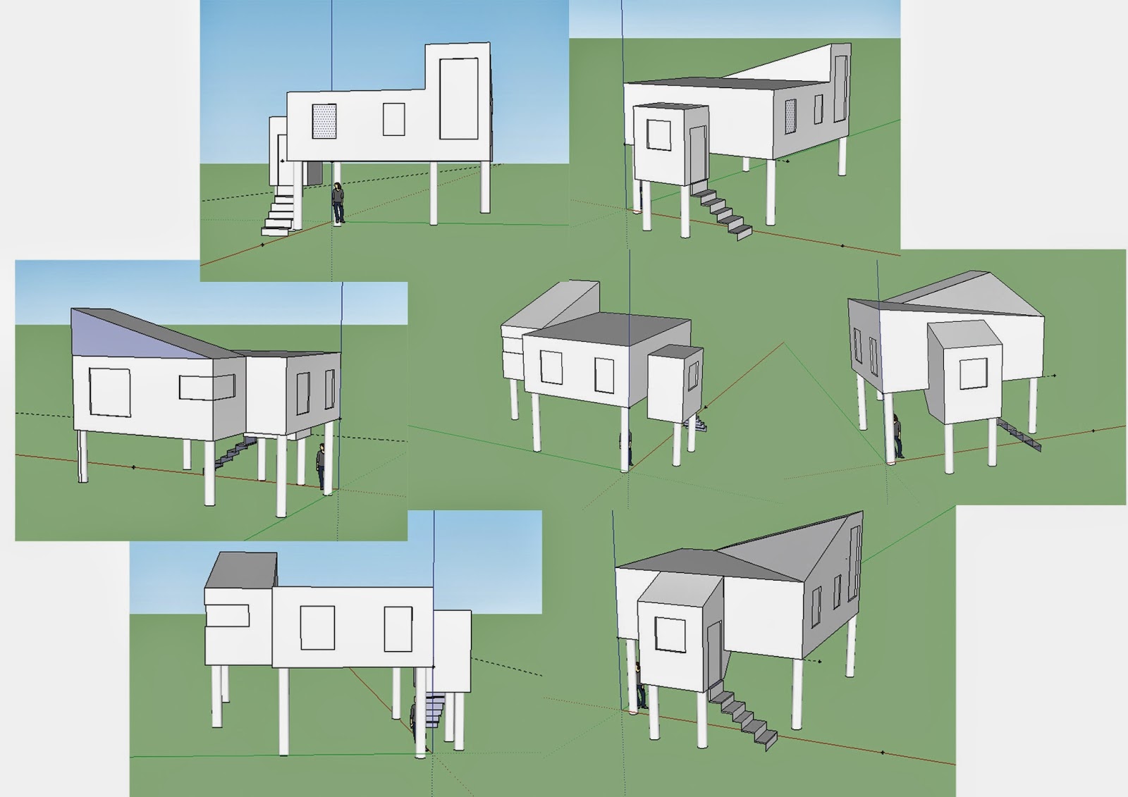
Very rough visualisations made on Sketchup for me to understand the proportions and therefore aesthetics of my idea. This shape has potential to have more slants as in my aesthetic precedents, or alternatively, a greater use of curves. 


This page explores some features of the house I will include that consider safety and taiponapona. 

Firstly, the house is a connection of two separate parts, perhaps signified by colour or materials. They are joined together in a design that is derived from knotting. 

Below this and to the right is a drawing of the wall plan. I intend to have a significant amount of glass at the bottom of the walls so that the inhabitants can see the feet of people in other rooms. This will increase the sense of safety as it creates transparency in the walls, without intruding on privacy. It would also be a nice feature, I believe, to install lights in the glass wall edges as this will be aesthetically pleasing. 

Finally, knotting as knitting is a pretty and flexible way to express this action. I intend to knit a cord of nylon, similar in weight and thickness of the twine used here and use it as an alternative to barbed/chicken wire on the windows. It will sit in front of the glass and distort the vision of people looking inside while also preventing smashed windows as it is a protective barrier that is in front of the glass.


I am also still interested in the idea brought up at interim, that the stairs could coil up to create a deck, thereby making the house totally inaccessible.

Thursday, 15 May 2014

The direction of my project has taken a turn and I am now re-exploring aspects of my spatial generator and the notion of safe houses. 


This clay model is a literal representation of a standard knot. It occurred to me that the shape it takes can be both interesting and beautiful. This experiment gave me the idea that I could use shapes derived from a knot in the structure and/or form of the house.

Anther experiment exploring connection via knotting

Precedents
aesthetic

Mima Architects
These two white washed houses are very aesthetically appealing to me at the moment. Particularly interesting and usable are the use of overhang in the above picture, which distracts from the cubic nature of the house. The Hafner House below appeals, I think, due to the use of different levels/heights to create interest and windows which highlight the structure. It also has a curved floor plan that would easily be incorporated into a knotted design.

Hafner House by Peter Gutherie
Precedent
safety

Closed state
This project looked specifically at safety, particularly locking intruders out. "Shutters" helped to close off the building, along with roller doors and bridge to the pool which can be elevated. Like a hermit, this building is not at all welcoming in its closed state.

Open state
Precedent
Taiponapona

Knot House by Mass Studies
These precendents use the idea of knotting directly in their structure, which has some engaging results. It's interesting to see how transportation (of people) is effected by these forms.

8 House by BIG

Apollo Architects

Precedent
disguise

Lucid Stead by Phillip K Smith
Disguise is a solution for danger often found in nature in both plants and animals. I believe this image, the use of mirrors could be a somewhat successful tool for disguise in architecture, despite the fact that houses are too big to hide, especially in a residential area like our project suggests.


Work Processes


The result of this sunlight study showed that most of the sun would be coming into the North-West side of the house, in this case, the back of the section. This means that the most frequently used rooms (lounge, kitchen, bedrooms) should be at the back of the house where the laundry, bathrooms etc could be at the front.

Tuesday, 13 May 2014

Ideas at Interim


Sketching/design process
Floor Plan (left= ground floor, right= first floor)


Perspective

At Interim Critique I presented these concepts, however, I was unsatisfied with my work. What I established was lacking was the little connection I had between two significant generators in the brief; taiponapona and crime prevention. From here, I rewound my design process to explore more ideas build from taiponapona and crime prevention that would influence the aesthetics of the house.

Saturday, 10 May 2014

Spatial Generator

Taiponapona- to knot things together

This term was an important catalyst. To me it referred to the action of connecting (or untying) things and I was also quite interested in the physicality of knotting. These are the results of some of these ideas:


The last image is a still from a movie I made about the action of knotting and the surfaces and materiality of various objects. Unfortunately, I came across some problems and couldn't export the movie, however I will remake it soon.